A comprehensive collection of ready-to-use user interface elements
A comprehensive collection of ready-to-use user interface elements
The UI Kit is a complete collection of user interface elements, including styles like colors, icons, and typography, as well as components such as buttons, tags, and badges. It also provides various patterns like sliders or charts. The best part is that all these elements are ready to use and can be easily downloaded from Figma, simplifying your design process.
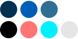
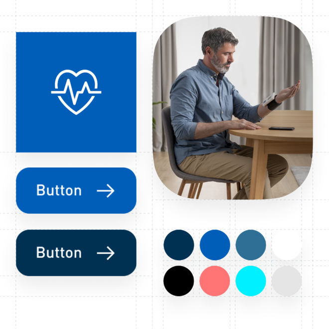
Colors
Our brand colors reflect OMRON Healthcare’s brand values and personality, underlining the strong connections with the medical community.
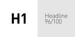
Typography
Our typography reflects the principles of objectivity, precision, and difference.
Brand shapes
Our brand shapes represent our brand personality. Each shape has its own function with a designated role.
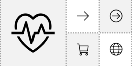
Icons
Our icons are designed to be easy-to-understand, with emphasis on brand identity and affinity for digital platforms.
Grid system
Our design system builds on the following principles. It uses a set of uniform, recurring elements and spacing based on 4, to ensure consistency, visual balance and ease of use.
Interactive animations
Micro animation adds value to the interface, improving both user and brand experience. It orients users to best understand our content, and creates an engaging, welcoming and connective moment, stimulating the joy of use.
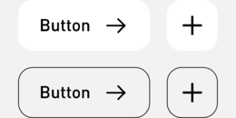
Buttons
Buttons, tags, tabs and other navigation elements. While interacting with the interface, users communicate directly with the brand, so it’s important that each state reflects the brand effectively.

Form elements
Dropdowns, checkboxes, radio buttons, input fields are typically styled to match the overall visual language of the brand and provide clear and concise labels and instructions to guide users through the input process.
Badges & notifications
Badges, eye-catchers, notifications, frames, tooltips and pop-up elements are non-interactive, read-only status indicator elements for highlighting important information and messages, drawing attention or reminding the user of something.
Loading indicators
Loading indicators, progress bars and spinners are designed to be unobtrusive, yet noticeable, providing users with the necessary feedback that the process is being underway without interrupting their workflow.
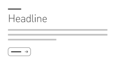
Text-based blocks
Headline, subheadline, bodycopy and text buttons are essential tools to present and emphasize textual content in a clear and engaging way, enhancing comprehension and guiding the user’s reading experience.
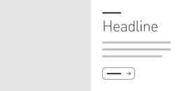
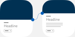
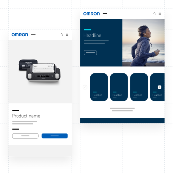
Text & image-based blocks
These elements are used to display visual content or combine it with textual information. Here you can find guidelines for image sizes, aspect ratios, positioning and alignment withing the block to maintain consistency and visual harmony.
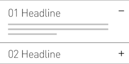
Tables & list elements
Tables and list elements are useful for filtering and sorting objects, helping the user understand and navigate complex information more easily.
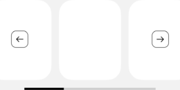
Sliders
Sliders offer a user-friendly, interactive way to input and adjust numerical values or make selections within a range, enhancing the overall user experience.
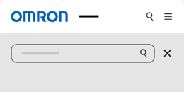
Header & footer
Headers and footers are navigational and branding elements with menu, search bar, logo, helping the user quickly and easily locate essential information, and maintaining consistency across different pages of the website.
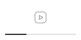
Videos
Here you can find guidelines and components for incorporating videos into your website with controls, formats and sizes in a consistent and user-friendly manner.
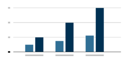
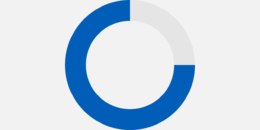
Charts & infographics
Charts are visual representations of data that help users understand and interpret complex information. Infographics are essential to delivering facts and information and help to
grasp the message quickly and clearly. Its data visualization also conveys our brand identity.
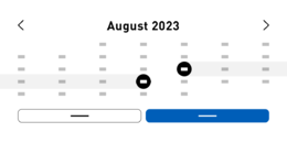
Date & time pickers
Date pickers are interactive components that allows the user to select dates and date ranges easily, consisting of a calendar-like interface with controls for navigating between days, months or years.
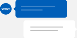
Chat function
You can increase sales and customer satisfaction with live chat. This is the fastest tool to help the user allowing them to interact in real-time. Here you can find all elements to create your chat function.
Your journey to empowerment begins with our brand guideline
Your Design Inspiration
Our Pages Templates showcase the potential of your website. Pick a pre-designed theme or draw inspiration for your unique design.
Learn more